


The Most Boring Logo We Could Find:From Your Logo Makes Me Barf
Another logo in the “Geography is Important” camp: The Whiteside County Health Department made a logo that is one step above typing the words out on one line.
So, you know, one step above this: “Whiteside County Health Department”.


 Via the Color Association, a watch by Nicolas Meiresonne that changes color depending on the time of day. Amazing.
Nicolas explains, “I thought of a bracelet with a color that shows what time it is. Blue/green = morning, yellow/orange = noon , red/purple = evening and night. The colors rotate around the bracelet. The color on top indicates the current “time”. When one colour reaches the top for a second time, 24H have past.”


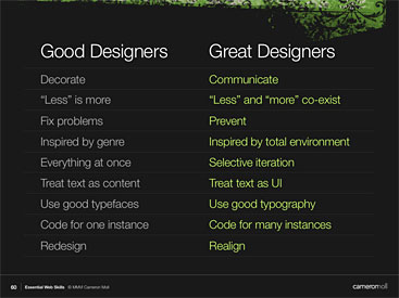 I'm addicted to marketing and communication blogs. I get cool ideas from so many smart people. The latest is Cameron Moll's presentation on good vs. great Web design. You can hear and view his presentation on his blog. Unfortunately, no picture of the kids' hair incident.


